-
 3–5 minutes
Automating a Risk Control Dashboard with Power BI MCP in Cursor for Free
Read More ->: Automating a Risk Control Dashboard with Power BI MCP in Cursor for FreeModern risk and control dashboards rarely fail because of visuals. They fail upstream, where definitions drift, calculations get re-implemented, and data governance lives in spreadsheets or people’s heads. In this walkthrough, I demonstrate how Power BI’s MCP (Model Context Protocol) can be used inside Cursor to automate much of that foundational work. MCP (Model Context Protocol) is an emerging standard that allows AI tools to directly inspect, reason over, and modify BI data models; including relationships, calculated fields, and semantic definitions. While the demo uses a triathlon training dataset, the workflow is identical to what we apply to risk and…
-
 3–4 minutes
Top 5 Power BI Dashboard Tips to Improve Your Reports Today
Read More ->: Top 5 Power BI Dashboard Tips to Improve Your Reports TodayPower BI has helped democratize dashboards by giving anyone, from aspiring data analysts to business managers, the tools to explore, visualize, and share insights. Building a Power BI dashboard that looks good is easy, but building one that actually works takes intention. In our last article, we looked at why most Power BI dashboards fail and the five common mistakes behind them. This time, let’s fix them with five practical, easy-to-apply Power BI tips you can use today.
-
 6–9 minutes
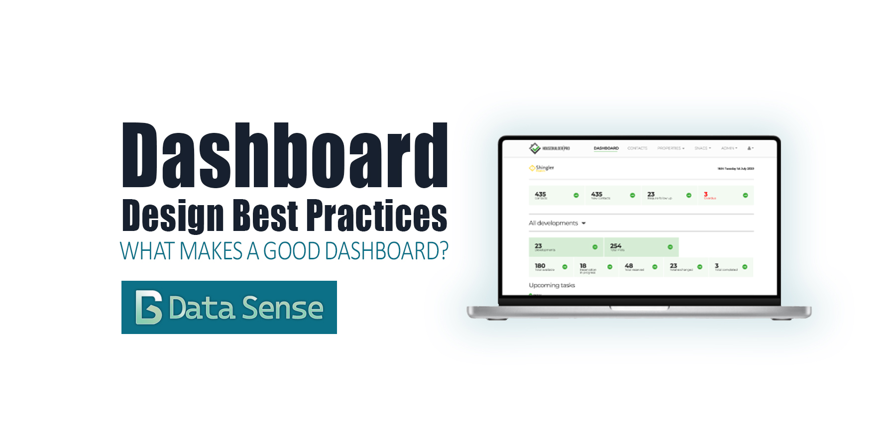
Dashboard Design Best Practices: From Charts to Clarity
Read More ->: Dashboard Design Best Practices: From Charts to ClarityOver the past few years, dashboards have become ubiquitous. Thanks to the “democratization of data visualization tools,” everyone is suddenly an analyst. With drag-and-drop interfaces and endless templates, it’s never been easier to pull data into a dashboard and share it with colleagues or executives. The problem? Most dashboards are bad. They don’t follow dashboard design best practices. You’ve probably seen them shared on LinkedIn: messy color schemes, overcrowded with charts, crammed into tiny panels, or spread across dozens of pages. They look neat, but they don’t communicate. At best, they confuse. At worst, they actively mislead.
BROWSE PAST POSTS
Blog Archives
Explore our entire collection of articles, organized by publication date.
Posts from
Power BI
View Year:
©2025 Data Sense. All rights reserved.