-
 3–5 minutes
Building a Dashboard That Leadership Actually Used (Case Study)
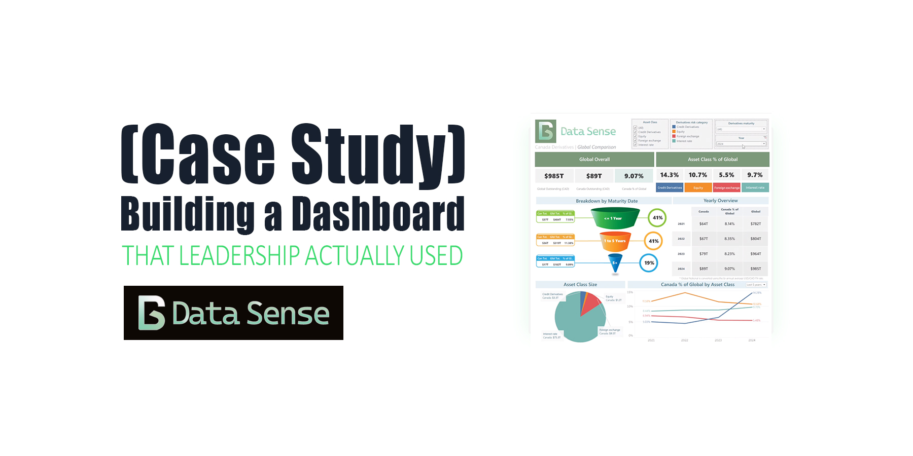
Read More ->: Building a Dashboard That Leadership Actually Used (Case Study)A case study on a global derivatives dashboard. What started as a simple Tableau build ended up shaping future ETL automation, data scraping pipelines, and dashboards for years.
-
 6–9 minutes
Dashboard Design Best Practices: From Charts to Clarity
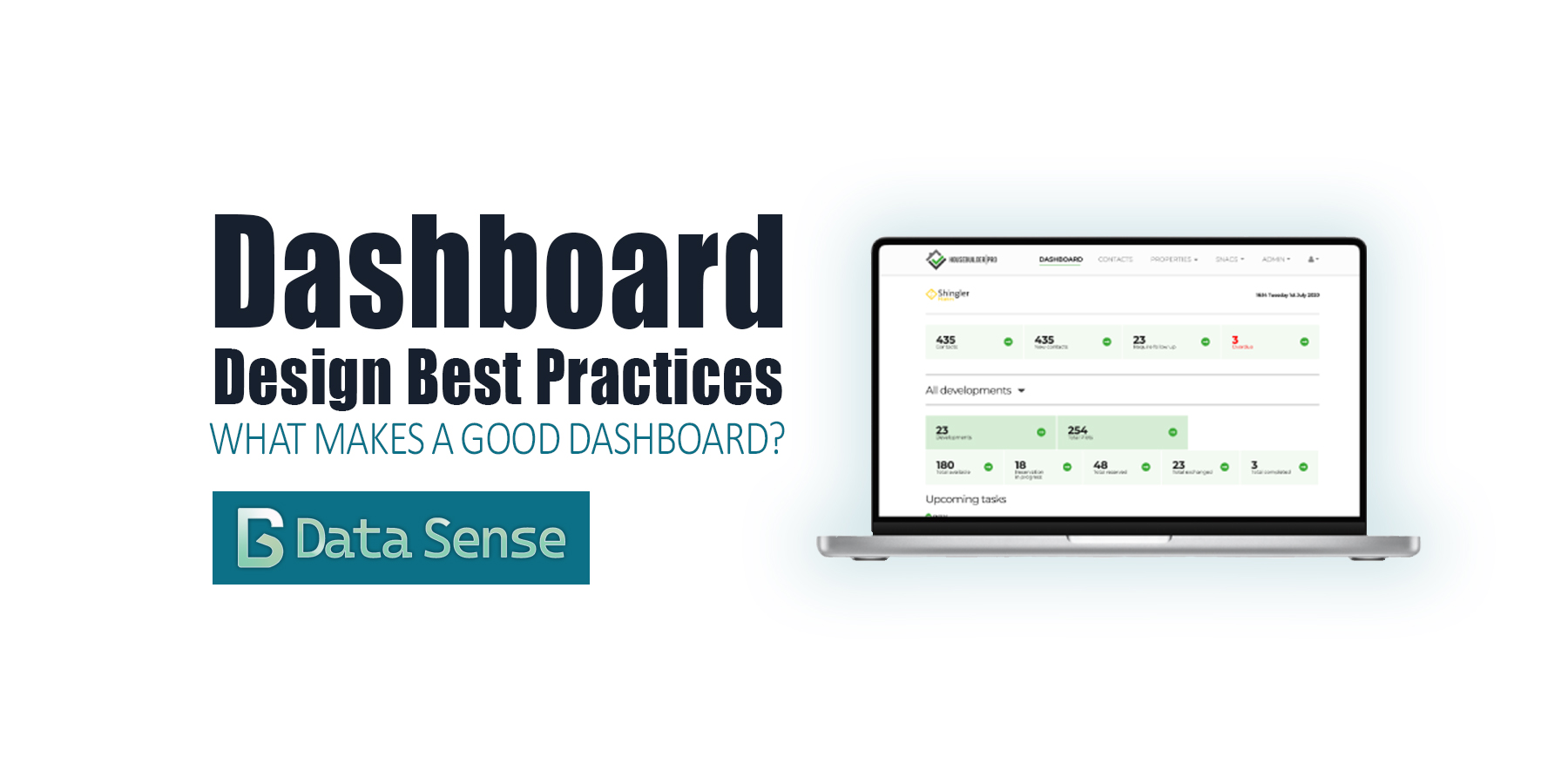
Read More ->: Dashboard Design Best Practices: From Charts to ClarityOver the past few years, dashboards have become ubiquitous. Thanks to the “democratization of data visualization tools,” everyone is suddenly an analyst. With drag-and-drop interfaces and endless templates, it’s never been easier to pull data into a dashboard and share it with colleagues or executives. The problem? Most dashboards are bad. They don’t follow dashboard design best practices. You’ve probably seen them shared on LinkedIn: messy color schemes, overcrowded with charts, crammed into tiny panels, or spread across dozens of pages. They look neat, but they don’t communicate. At best, they confuse. At worst, they actively mislead.
BROWSE PAST POSTS
Blog Archives
Explore our entire collection of articles, organized by publication date.
Posts from
Tableau
View Year:
©2025 Data Sense. All rights reserved.